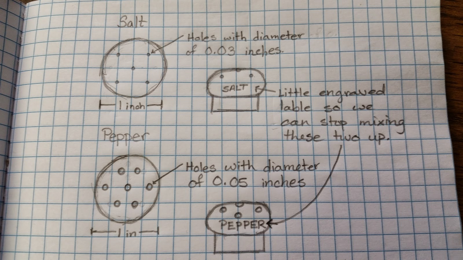
For this project, we had to find something where form doesn't correlate with its functionality. For me, I chose salt and pepper shakers because they're a subject that really annoys me in the areas where company's that design beautiful products can't tell that there is a significant difference between salt and pepper that should make their designs different. Not to mention, restaurants are always mixing the two up, so the rate of which the salt and pepper exit the container are way too different.
*read more in my wibbly wobbly timey wimey bendysnaps cucumberface filled presentation in the below link ^v^*
https://docs.google.com/presentation/d/1-UFVgpFMJZMTHyvCNIs32J2j173RPr1bVzzqP3_zWs8/edit?usp=sharing

The feedback I received on my design didn't really involve my design but more the gifs I used...
But overall, if we could get all companies that design dining ware to take this into consideration, the world would be a better place.

No comments:
Post a Comment